Eagles, daisies and a mythical beast: new social space graphic designs take inspiration from College’s history
“The specially commissioned branding, unveiled for the first time, translates classic iconography drawn from the College’s 500-year history into fresh and contemporary form”
The flick of a raptor’s wing, delicate flower petals and the swivelling horns of a mysterious mythical creature will give a unique new visual identity to a transformed social centre opening at St John’s at the end of January.
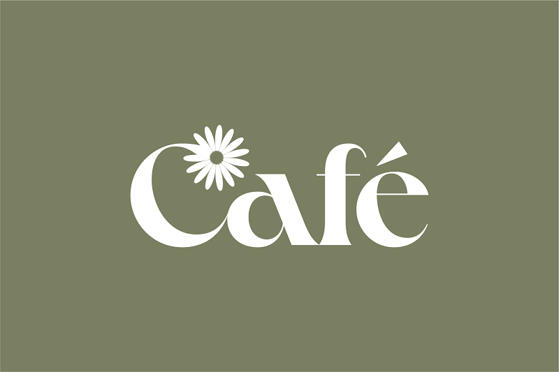
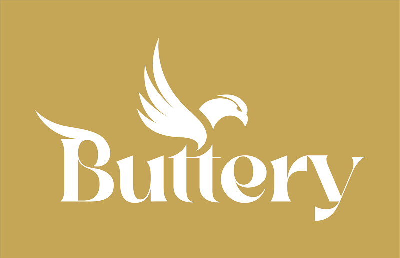
The specially commissioned graphic designs, unveiled for the first time, translates classic iconography drawn from the College’s 500-year history into fresh and contemporary form. Three logos, playfully echoing imagery and symbols found across St John’s’ architecture, sculptures and decorative detailing, will help define the modern social spaces of the updated Café, Bar and Buttery, appearing on everything from digital displays, menus and bar price lists to staff aprons and takeaway coffee cups.
Devised by Cambridge-based graphic designer Dan Gould, in collaboration with College members including students and the Master, Heather Hancock, the new images feature three key elements, each linking back directly to St John’s’ founder, Lady Margaret Beaufort. The airy reconfigured Buttery will be symbolised by an eagle, a regal creature central to the Beaufort crest which appears in material form across the College site and lends its name to clubs and publications. A yale, a mythical beast perhaps based on an ibex or goat and also present on Lady Margaret’s coat of arms, provides the logo image for the cosy Bar, complete with opposing horns able to swivel forward or back. The comfortable new Café, meanwhile, is represented by a daisy or ‘marguerite’, another image associated with the College founder thanks to the pun on her name.
Each graphic symbol is skillfully incorporated into the lettering of the location, which is picked out in the striking contemporary typeface ‘Crake’: a distinctive calligraphic font combining organic details with strong geometric shapes. The three spaces are also defined by specially selected colours: Vivid Auburn Red for the Bar, Buttery Gold for the Buttery, and Limed Ash Green for the Café.
Dan, whose clients have included Google, Bosch, MIT and the United Nations, said a first walk through the College had provided instant design inspiration. “I got lost in this labyrinth of corridors and courts and high vaulted ceilings. I was just amazed by St John’s. There is so much visually going on: it’s full of history and symbolism. This is a dream project for a designer: there is just so much to use.”
One of the dominant images of St John’s, the yale, appears in a variety of forms around the site. A lone beast glares from the newel post of A staircase in Chapel Court, and 16 hooved and bearded pairs can be spotted elsewhere, including carvings on the Great Gate and two striking new stone sculptures guarding the gates leading to Kitchen Lane and Third Court.
Much-loved by Lady Margaret – her feet even rest on a doe-like version in an effigy on her tomb in Westminster Abbey, and a pair of yales are supporters of her coat of arms – the creature was first written about by Pliny the Elder in Book VIII of his Natural History. He describes the ‘Eale’ as a creature found in Aethiopia: ‘It is the size of a water-horse [hippopotamus], with an elephant’s tail, of a black or tawny colour, with the jaws of a boar, and moveable horns more than a cubit in length, which in a fight are erected alternately, and presented to the attack or sloped backward in turn as policy directs.’
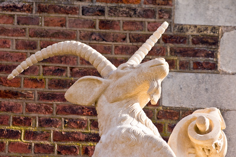
With a name thought to be derived from the Hebrew word ‘yael’, meaning ibex, the beast is something of a shapeshifter, with its ragbag of physical characteristics varying according to artists’ differing interpretations. At St John’s, the weather too had an impact: the original 18th century precursors to the Kitchen Bridge sculptures were so eroded that in 2010 the head of one toppled off into the Cam and, according to one observer, the once rugged beasts were smoothed down to Labrador-like dimensions.
In his mission to create a logo version of the mythical creature, Dan began by documenting the College’s physical examples. “I went round taking photographs of yales – every one was different. Then I began drawing yale after yale.”
For Dan, the work begins in old school fashion: with paper, soft black 6B pencils and sometimes chalk. “I make a mess. With a computer, you can make things too perfect straight away, and you don’t get the organic end result you want.” The quest, the designer explains, is to combine text – in this case the words, Bar, Buttery and Café – with an image, creating a seamless visual link. “The best logos have a cleverness about them. They’re pictorial but they aren’t pictures. A logo design is reductionist: it should be as simple and unique as possible because then it will sear into people’s sub-conscious.”
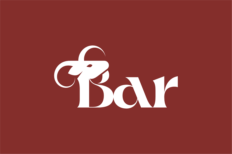
The pared-down yale head, complete with opposing horns, adorns the initial B of Bar, it’s goat-like beard forming the top curve of the letter and the lower curve hinting at its body. Though complex, the final design was simpler to achieve than the eagle, whose flowing wing and hooked beak rise from the double letter ‘t’ at the centre of Buttery. “The eagle was the hardest of the three symbols to get right,” Dan said. “You can’t just draw an eagle as if it were an illustration for a tattoo, you have to reduce it to its simplest shapes.”
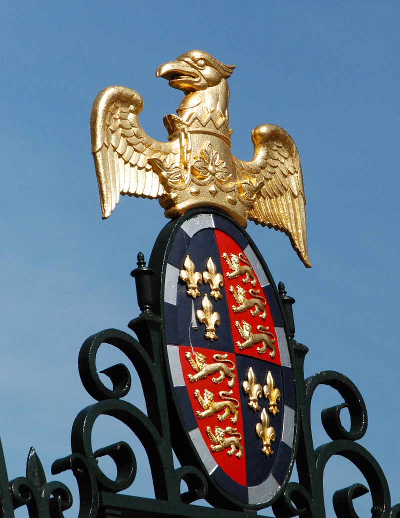
The eagle, standing proudly with a coronet encircling its neck on Lady Margaret Beaufort’s crest, is the symbol of St John the Evangelist, whose statue appears – an eagle at its feet – on the College’s Great Gate. More of the great birds adorn buildings, sculptures and decorative panels, complete with arcing feathers and predatory gaze.
Representing that fierceness while creating a welcoming logo for the College’s central social hub created a design challenge for Dan, however. “We needed a process of iteration over several weeks because at first it looked a bit evil, as if it was going to peck your eye out. But, if you reduce the hook of the beak and the flick of the eye too much, you end up with a pigeon, which is definitely not what you’re after. They have to be predatory. Hopefully the final version is eagle-like but not evil.”
The dramatic vaulted ceiling of the Buttery also influenced the logo, creating one of the ‘secret’ elements of the design that may never be noticed by most viewers but are central to the creative process for Dan. “The joinery has lines in parallel which get smaller as they get further away, creating all these curves. I wanted to use that inspiration for the eagle’s wing.” The arcs are represented in a stylised wing and dipped head on the initial B of buttery. The two middle letter t’s, meanwhile, give the observant viewer a comical hint of an eagle’s stocky legs.
The third and final logo, the daisy representing the Café, was the simplest of the three to create, said Dan. Lady Margaret is associated with two flowers both found dotted decoratively around the College: the marguerite daisy – nodding to her name – and the forget-me-not, which plays on her family motto, “Souvent me souvient”, an Old French phrase translating both as ‘think of me often’ and ‘forget me not’. The latter flower was used as the logo for the College’s new podcast, ‘Souvient’, while the daisy provided the perfect sunny symbol for the Café, its stem curving to create flowing capital letter C.
All three logos are visually linked together by their shared typeface, Crake, which sets a distinctive tone, subtly bringing references to St John’s five centuries of history up to date. “The brief was to avoid anything too traditional and to have a contemporary twist,” said Dan. “I looked for a long time for the right font that would be suitable for all three spaces. Fonts work sub-consciously and often people can’t quite articulate why it’s wrong or right. Here, it had to have a friendliness: you couldn’t have Times New Roman, for example, which you can imagine chiselled into a classical archway. Crake has both geometric curves and straight lines, but also an organic feel inspired by nature. The descenders [the upright strokes of letters] might come down at an angle, and some of the curves feel drawn from the natural world.”
Set against a warm and sophisticate colour palette, whose tones complement each other while giving each social space its own individual identity, the trio of logos is ready to take its place amid the complex historic mix of iconography at St John’s. The designs will be debuted when the new spaces officially open in the coming weeks.
For Dan, whose design work encompasses logos, branding, websites, user interfaces and print design, the project has proved a thrilling step into an unfamiliar and timeless world. “It has been a real honour to be involved in branding something that is part of such a historic institution and creating designs for places that will be used for centuries to come.”
Published 20/01/2023